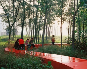
The Red Ribbon, by turenscapes
Image by http://www.turenscape.com/english/projects/project.php?id=336
While looking at this project, memories from Christo and jeanne-Claude came to my mind, since it is kind of like The Running Fence and The Gates project, a continuous path that poops out from its sorroundings
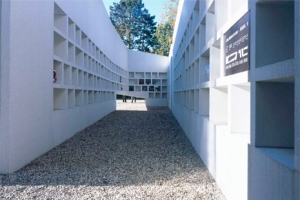
De Nieche Ooster Cemetery, by Karres en Brands
Image by http://www.karresenbrands.nl/_projects_en.php?id=43
The images that come to my mind when I see this are that of a corridor of a house with shelves on the sides, and decorative bases in them, but is an actual cemetery, which is kind of scary.
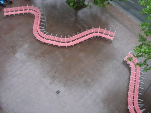
Pink Bench, by Gonzales Haase
Image by http://www.gonzalezhaase.com/works/show/70pinkbench/index.php?show=070150&item=01
I was intrigue by this project as well, since it also resembles a little to The Red Ribbon Park and Christo and jeanne-Claude’s projects, they become really eye catching and this one in particular is used as a bench and as a place for people to park their bicycles, making it more useful.


hope it was wearing Depends.
Emelio,
The project “The Red Ribbon” by turenscapes can also be compared to Robert Irwin’s “Two Running Violet V Forms” from the Stuart Collection we visited last quarter in our filed trip. Both pieces integrate time as an element when observing them, and both use color and continuous lines, although different shapes, as a way to show intrusion into the forest. Refer to link.
http://stuartcollection.ucsd.edu/artists/irwin.shtml
Thanks, Ivan
Emelio and Ivan – I appreciate the reference to projects from last quarter as it shows that they engaged you enough to remember them. However, Emelio, there are issues with your statements because they miss the point of this assignment.
Scores:
3 – whenever you see something colorful it is always obvious to say it “pops out of its surroundings”; to be more articulate you could talk about contrast. For example, “the smooth red bench winding through the vegetation reveals its dense coverage on the ground”. Because of the red bench we see something about the site that we wouldn’t otherwise notice.
5 – you actually got the point here even though the actual articulation of the idea needs a lot of massaging; based on your own very acute observations a more appropriate statement would have been “the domestic furniture-like quality of the cemetery made evident the eery unemotional side of dealing with the dead”.
3 – similar to “popping out”, “eye catching” is another word to avoid; a more appropriate statement would be: “the winding form and pink color of the bench/bike racks call attention to the flat empty site” or if you observe a bit closer “the gap between the two benches mark the entrance to this area”.